01 Jun Mobile SEO in 2020: The Ultimate Guide and Tools For Optimization
Mobile Optimization
Mobile optimization is the process of ensuring that visitors who access your site from mobile devices have a device-optimized experience.
Nowadays people spend more and more time on mobile and tablets for Google search. But still many websites are not designed to account for different screen sizes. Page speed, site structure, site design and many more factors are required for a mobile-optimized website.
What is Mobile SEO?
Mobile Seo refers to the search engine optimization of websites and optimizing it for the users on mobile devices and tablets. After all, Google also favoured mobile-friendly sites. As more than 60% of Internet users now search on mobile devices and smartphones.
Why is Mobile SEO Important?
Mobile Seo is important for websites as the number of people searching on mobile devices and smartphones are increasing.
According to Google, there are 27.8 billion more search queries performed on mobile than desktop. As 58% of all the searches on Google are done from a mobile device or a smartphone.

This trend is going fast and we can predict that mobile will be the future of search queries.
What Is Google’s Mobile-First Index?
Google rolled out its Mobile-Friendly Update (Which is also called “Mobilegeddon”). This update was rolled out to penalize the website that wasn’t mobile-friendly.
But if the target audience of your website doesn’t search that much from their phone, then this update wasn’t a big deal.
Google’s Mobile-First Index ranks the search results based on your mobile version of the page. Even you are searching from a desktop.
Before this update, Google index would use a mix of mobile and desktop results to the users.

So, before if someone searches from mobile devices, Google showed mobile results. And if someone searches from desktop and they would be shown desktop results.
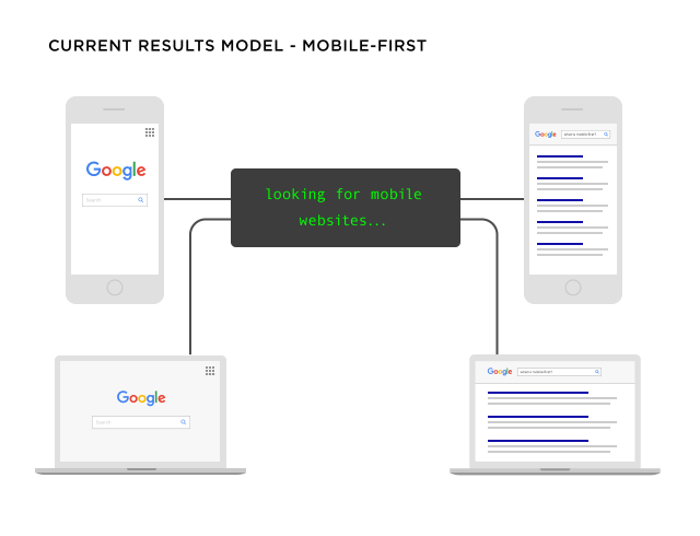
Now, Google shows the results from their mobile index irrespective of your searching device.
What Does Google Consider “Mobile”?
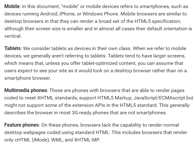
Most of the People, a “Mobile Device” means a smartphone or a tablet.
However, Google doesn’t consider tablet devices as a mobile device.
How to Implement a Website for Mobile Configuration?
Best way to have a good mobile user experience is by choosing the best way to set up your mobile configuration.
Many websites are incorrectly configured for mobile search or not configured at all, resulting in a huge loss of smartphone traffic.
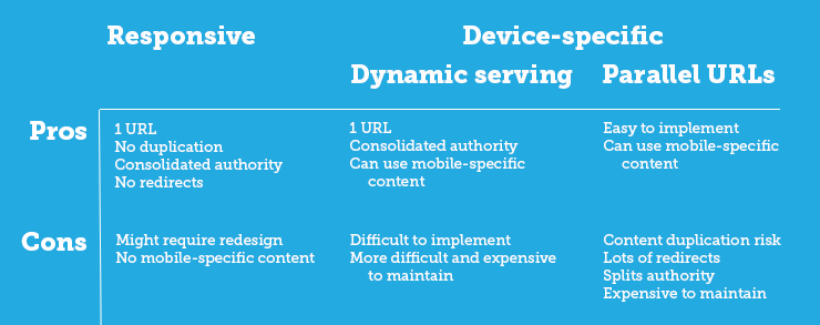
According to Google, Mobile websites can typically run on one out of three different configurations:
- Responsive design
- Dynamic serving
- Separate URL’s

Responsive Web Design (RWD)
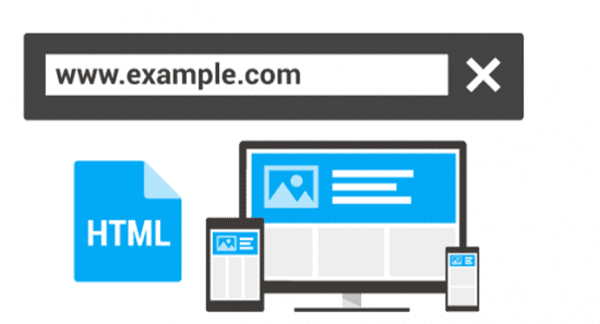
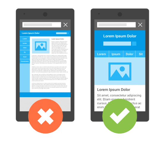
Responsive web design serves the same HTML code and content on the same URL regardless of the user’s chosen device. But, the display setting will be different according to the user’s screen size. Use the Meta name= “viewport” tag in your website to help the browser identify and adjust the content according to the size of the screen.
- Content will be on the Same URL
- Easy to share content
- It requires less seo work
- User Friendly
- Easy to get backlinks
- It will be easier to index on Google
- There will be fewer redirects and avoid content duplication
- Google recommends Responsive Web Design
Dynamic Serving
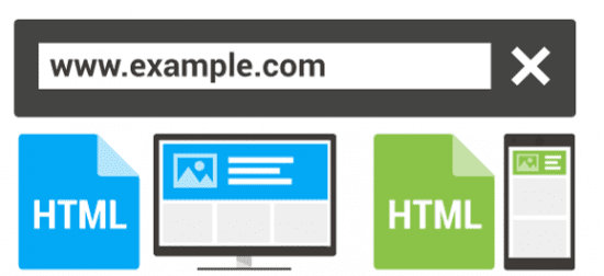
The dynamic Serving configuration is designed to have the server to use the same URL regardless of which device user uses. But it shows different HTML/CSS for different devices the users are using.
Displaying different content based on the user agent is called dynamic serving and is done using Vary HTTP headers. A valid header tells the browser how to display the content and helps Google Bots discover that mobile-optimized content on your website is much faster.
Dynamic Serving is not the perfect configuration for your website. As, It has to be updated regularly, which means every time a new device launch in the market that list needs to be updated.
Dynamic Solution works best if the motive of the users in desktop search and mobile searches are different, or if you want to serve some content to desktop users and not to mobile users. Ex: – Videos, ads, or other large files.
Separate URL’s
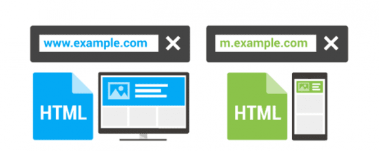
In Separate URL’s Configuration, you have to maintain two separate websites with different URL’s and the different HTML Code for each device and websites. This configuration detects the user’s device and then redirects the users to the appropriate page using HTTP redirects along with the Vary HTTP header.
This configuration has the risk of creating duplicate content for the search engine if you are not careful or if you don’t use proper (“rel=canonical” and “rel=alternate” tags). It also requires twice the work for site maintenance and seo work.
How to Mobile Optimize Your Site?
Mobile Usability Test
To boost your Mobile friendly seo your website needs to pass Google’s Mobile-Friendly Test.
Since you can get a page-by-page basis report, check each of your important pages. The results will list issues you might need to fix or will give you the “mobile-friendly” green light:
There is another tool which let you know if your website has any mobile usability issues.
You can check out Google Search Console tool. And Click on “Mobile Usability”. And Google will let you know if mobile users have trouble using your site.

Don’t Block JavaScript, CSS, and Image Files
Developers used to block Googlebot from accessing Javascript, CSS and image and some other parts of the site’s code, which is against Google’s guidelines.
This was not an important factor before, but today it is an important factor to rank your website.
Googlebot should be able to crawl your full website, if Google cannot crawl your full website, it cannot tell its mobile-friendly or not.
And if they are not sure whether its mobile-friendly or not, it will be very difficult to rank your website in the mobile-first index.
Check out your robot.txt file. This will let you know if you’re blocking Googlebot from crawling or hiding certain parts of your site.
Popups
Popups are something which no one likes, Even Google hates Popups…especially for mobile users.
Google rolled out an update that specifically targets “Intrusive” popups. Google gives a few examples of which popups are acceptable and which are not.
If your website is using a giant popup on your website, and content is hidden behind that popup, it could impact your mobile rankings.
Let Mobile Users See It All
Developers would block certain resources like Javascript, or some content to from mobile users. As these also helped them load their page faster on mobile devices. And it also has improved the user experience on mobile devices.
Google now considers your page’s on the mobile version as the main version of your website.
And if you have blocked some of the content or certain resources, then they may not be an index or crawl. Or they may be treated by Googlebot differently.
To fix this issue use your website on different mobile devices. If desktop users see something that mobile users don’t, get that issue fixed.
How to Optimize Your Mobile Site for User Experience
Site speed
Slow page-load speed can hurt your website and ranking. It will also lead to the poor user experience which could also lead to high bounce rates.
Because of hardware and connectivity issues, page speed is more important for mobile users than desktop users.
To reduce page speed time on your website you should optimize images, minify codes, leverage browser caching and reduce redirects.
Some tools can help you know how quickly your website loads and also gives you the recommendation that you need to implement to load your website faster.
You can check out Google’s Page speed Insight or WebpageTest.org tool for your site so its loads fast.
Good User experience on mobile
The user on mobile devices have small screen sizes, so the content for small devices should be well optimized and easy to read. It should be big and bold.
Optimize Video and Animated Content with HTML5
Video and Animated Content works best with HTML5, if your website has content coded in flash, it will not be going to work on mobile devices. And your users will be missing all the fun.
So, it’s suggested that you use HTML5 for video and animations to improve the website’s usability on all devices.
Don’t Forget the “Viewport Content” Tag
When you are using responsive web design in your website, make sure to set the viewport content tag right. As this tag changes the size of your page based on the user’s device.
If your tag is not configured correctly or you forget this tag, then your site could look unorganized to the mobile users.
Make sure you set up your viewport tag like this:

Advanced Mobile SEO Tips and Best Practices
Fix Your Mobile CTR, Get More Traffic
Organic click-through-rate is a huge Google ranking factor and if Google sees that your website is not getting clicks on your mobile results, the website ranking is going to be affected.
You can check out your website CTR from Google search console performance report.

Next, click on “+New”
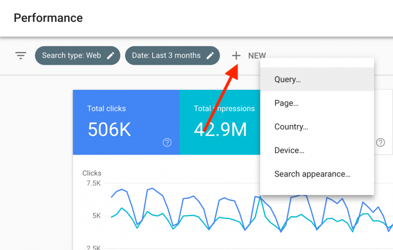
Click “Device”
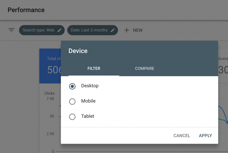
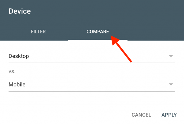
And hit “Compare” to compare desktop vs. mobile:
Finally, take a look at how your desktop and mobile CTR size up.
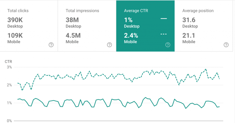
Here, you will notice that your mobile CTR is far away better than your desktop CTR.
Here you will get insights on your keywords ranking and which keyword is being searched from mobile and which from the desktop.
So, through these insights, you can come up with a plan to increase your mobile CTR.
Mobile Vs Desktop Bounce Rate
Google’s Mobile-first Index which you have read about it, it means that Google is giving priority to mobile devices, so it also puts more weight on mobile user experience signals.
If mobile users are bouncing back from your website that will impact your ranking.
You can check and compare your mobile Vs desktop bounce rate in Google analytics.
If there’s a big difference between desktop and mobile visitors, you need to check this page on your website and fix it if anything is wrong on that page.
Optimize Your Mobile Page Speed
To load your website faster and quick you should optimize your images and reduce the file sizes of your images.
Implement browser cache in your website, as caching make your site load faster.
Use CDNs which make page elements loads 2-3 times faster.
Optimize title and Description Tags for Mobile SERPs
Most of the website gets a majority of traffic from mobile as mobile searches are more than desktops.
You will be a little shocked to know that Google gives you more space in title tag characters in mobile as compared to desktop.
In Desktop the Title limit is approximately 70 Character and for Meta description, it is approximately 155-160 Characters.
And in Mobile, the Title limit is approximately 78 Character and for Meta description, it is approximately 155-160 Characters.
So you have got more space to display your title in mobile, but it will not get fully display in desktop.
But, if you are receiving a majority of traffic from mobile, then it will be worth it and may increase your mobile CTR.
Should You Implement AMP?
AMP refers to Accelerated Mobile Pages which are the Stripped down version of your webpages which are designed to load your website quickly on mobile devices.
AMP is Google Project and it shows a little icon in search results.
Now, the question is to use AMP or not?
Let’s go through this:
AMP limits the control on your website or webpage functionality.
Your site will lose the full control of your ads, Popup, it also restricts the CSS which will make your content look generic.
AMP will hurt your link building efforts, as while someone links to your AMP pages that link points to the Google.com domain.
So, to use AMP or not it will be completely your choice. If you are using AMP you should have a compelling reason to do so.
Use Schema Structured Data
Schema.org or Structured data are effective as it affects the SERP’s display and search results. It also helps in significantly increase your organic CTR.
Structured data helps your website to display the site in SERP with review stars, recipe images, event dates and many more.


No Comments